This 2009 Trading Strategy Still Wins 75% of the Time
More than half the track record came after publication. Across ES and NQ, the combined model produced a 3.00 profit factor, 16.14 Return/DD and only 0.25 weekly correlation.

Some trading ideas look great because they were built using everything we know today.
This one is different.
The original Multiple Days Down model was published by Larry Connors and Cesar Alvarez in 2009 in Short-Term Trading Strategies That Work.
That matters because we now have roughly 17 years of market data that came after the rules were released.
The original strategy could not have known what would happen during COVID, the 2022 bear market, the 2024 rally or the current market environment.
Yet the edge has continued to hold.
Today we are going to test it on both ES and NQ, combine the two versions into a portfolio, then add them to several previously released models.
The final result shows something important:
You do not need completely different strategy categories to gain diversification.
Even strategies that are broadly doing the same thing, buying market weakness, can produce very different return streams when they use different logic, timing and markets.
More Than Half the Results Are Out of Sample
This is the most important part of the test.
The model was publicly released in 2009.
Our ES test begins in 1997 and our NQ test begins in 1999. That means roughly 17 years of the performance shown happened after the original rules were already public.
More than half of both track records are effectively post publication out of sample results.
This does not guarantee the strategy will continue working.
Nothing does.
But it gives the test far more weight than a model created today and fitted across the entire history.
The rules were already known.
The future data arrived later.
The strategy either continued to work or it did not.
In this case, it continued to work.
The ES Results
We will start with the model applied to ES daily bars.
The ES Results
This is a long only dip buying model that waits for a specific form of short term weakness inside a broader bullish market.
The exact rules and code are included later in the article.
ES performance
Total net profit: $115,037.50
Total trades: 206
Winning percentage: 75.24%
Profit factor: 2.60
Average trade: $558.43
Average winning trade: $1,207.18
Average losing trade: $1,413.24
Time in the market: 9.21%
Maximum consecutive losses: 3
The first number that stands out is the win rate.
The model won on just over 75% of its trades across nearly three decades of data.
A high win rate alone does not make a strategy good. You also need to look at the size of the wins, the losses, the drawdown and whether the performance remains stable through time.
Here, the high win rate is supported by a 2.60 profit factor.
That means the strategy produced $2.60 in gross profit for every $1.00 in gross losses.
That is strong for a simple daily model.
ES equity curve
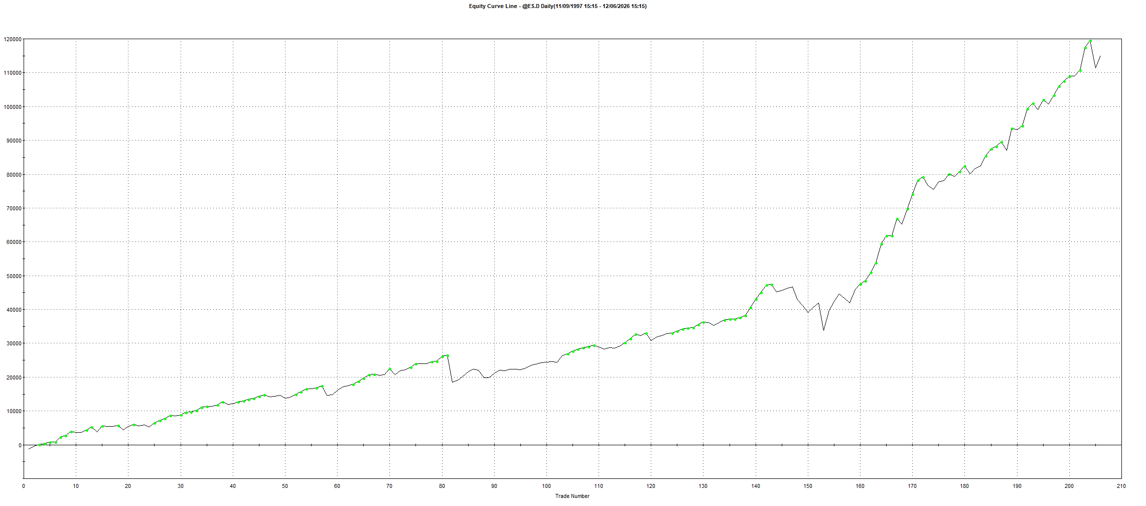
The equity curve is not perfect.
There are flat periods and drawdowns, as there should be in any realistic long term strategy.
But the overall behaviour remains consistent across different market environments.
The model is also only exposed to the market around 9% of the time. It is not sitting permanently long and relying on the long term upward drift of equities.
It waits for its setup, enters, then gets out.
ES performance by month
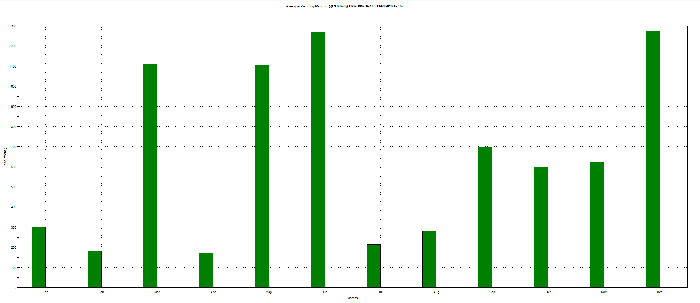
Every calendar month was profitable across the ES sample.
The strongest average months were:
March
May
June
December
June and December produced the highest average profit, both near $1,270.
The important point is not identifying a single best month. It is that the edge was not dependent on one small seasonal window.
The profitability was spread throughout the year.
The NQ Results
Now we apply the same model to NQ.
No completely new concept.
No rewriting the strategy around Nasdaq.
We are testing whether the same behavioural tendency exists in a second equity index.
NQ performance
Total net profit: $198,150
Total trades: 188
Winning percentage: 75.00%
Profit factor: 3.33
Average trade: $1,053.99
Average winning trade: $2,007.52
Average losing trade: $1,806.60
Time in the market: 9.17%
Maximum consecutive losses: 2
The NQ version is even stronger.
The winning percentage remained almost identical at 75%, while profit factor increased to 3.33.
The average trade also increased to more than $1,050.
NQ naturally produces larger dollar swings than ES, so the higher average trade is not surprising. What matters is that the basic behaviour transferred without the edge collapsing.
NQ equity curve
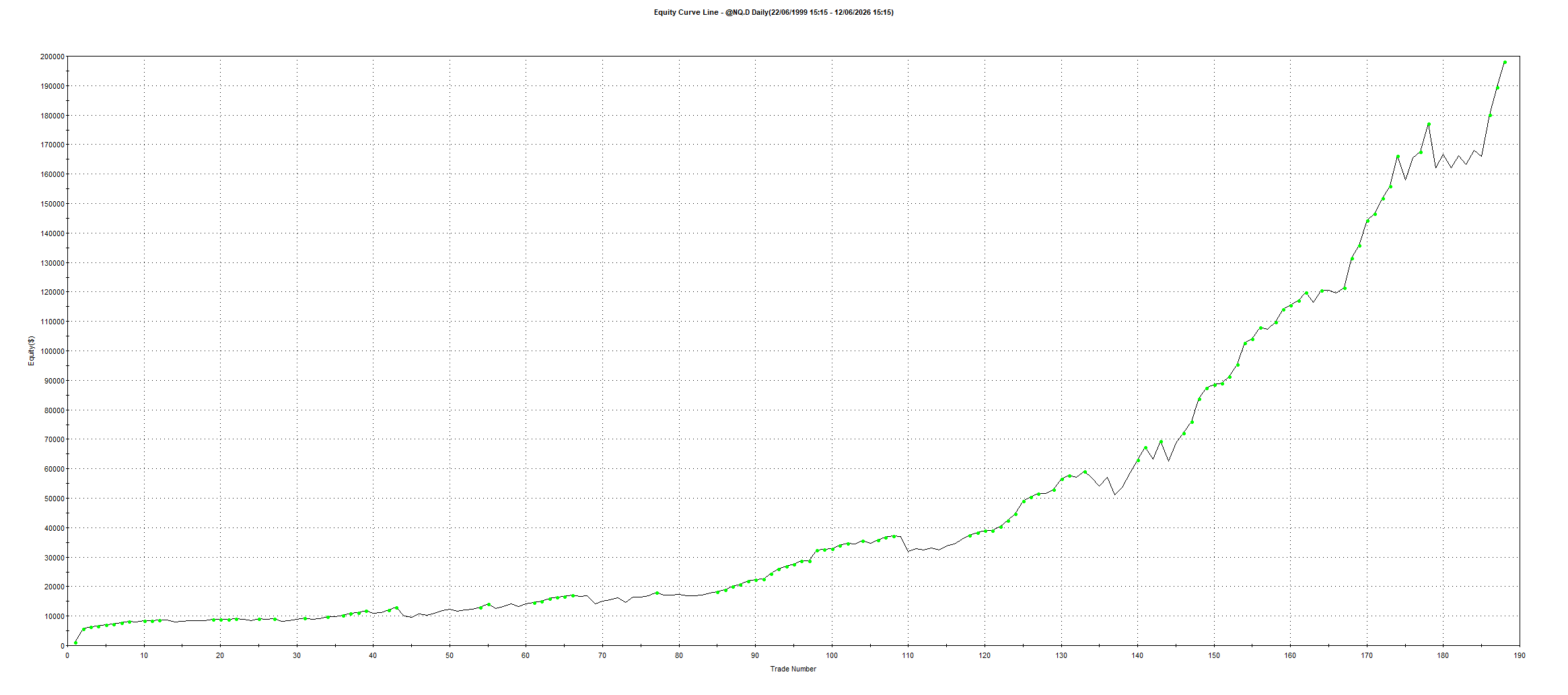
The NQ equity curve shows the same broad pattern.
Long term growth.
Periods of stagnation.
Occasional sharp drawdowns.
Then recovery and new equity highs.
This is what a real strategy normally looks like.
It does not produce a perfectly smooth line. It moves through good and bad environments while maintaining a positive long term expectancy.
They Both Buy Dips, So Aren’t They the Same Trade?
This is where the results become more interesting.
Both models use the same broad idea.
They buy short term weakness in an equity index.
You might assume the ES and NQ versions would be almost identical.
They are not.
The weekly correlation between the two strategies was only:
0.25

A correlation of 1.00 would mean the strategies move together almost perfectly.
A correlation near zero means the return streams behave largely independently.
At 0.25, these models are related, but still different enough to provide meaningful diversification.
That happens because ES and NQ are not the same market.
They have different volatility.
Different sector weightings.
Different reactions to interest rates.
Different daily movements.
Different recovery patterns after weakness.
The broad idea may be similar, but the trades do not always occur at the same time or produce the same result.
This is an important lesson.
The strategy category does not determine the correlation. The actual return stream does.
Two strategies can both be labelled dip buying and still work well together.
Combining ES and NQ
Now we combine both versions into one portfolio.
One ES model.
One NQ model.
Same general behavioural edge, but two different return streams.
Combined portfolio results
Total profit: $313,187.50
Total trades: 394
Winning percentage: 75.13%
Profit factor: 3.00
Average trade: $794.89
Maximum drawdown: $19,402.50
Return/DD: 16.14
Maximum stagnation: 772 days
The portfolio maintained the high win rate.
It maintained the high profit factor.
But the important improvement is the relationship between return and risk.
What Return/DD Actually Means
Return/DD compares total profit with the maximum historical drawdown.
The portfolio produced:
$313,187.50 in total profit
$19,402.50 in maximum drawdown
16.14 Return/DD
In simple terms, the backtest generated roughly $16.14 in total profit for every $1 of maximum historical drawdown.
Higher is better.
This is one of the cleanest ways to compare strategies and portfolios because it stops us from looking at profit alone.
A system can always create more profit by trading more contracts.
That does not mean it became better.
Return/DD tells us whether the additional return was worth the additional pain.
Here, the low correlation allowed the two systems to add their profits together without their drawdowns stacking in the same way.
The standalone drawdowns did not simply get added together.
Why?
Because the strategies were not always losing at the same time.
That is the portfolio benefit.
Combined equity curve
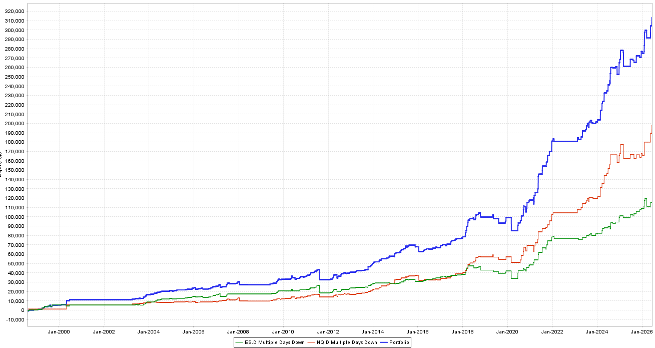
The blue line represents the combined portfolio.
The green and red lines represent the individual ES and NQ strategies.
The portfolio grows faster than either strategy alone because it receives contributions from both return streams.
When ES slows down, NQ can continue producing.
When NQ enters a weaker period, ES can help carry the portfolio.
They do not need to be negatively correlated.
They only need to avoid moving together all the time.
The Annual Results
The combined portfolio produced a profit in 20 of the 24 calendar rows shown.
Only four years were negative:
2008
2011
2019
2022
The losses in those years were also relatively small compared with the strongest profitable years.
That does not mean future losing years will remain small.
But it shows how combining the two markets improved the consistency of the original idea.
The model was not dependent on one isolated period.
It continued producing across different volatility environments, interest rate cycles, crashes and bull markets.
This Is Why I Prefer Adding Edges Over Adding Size
A lot of traders increase exposure by taking one successful strategy and trading more contracts.
That works until the strategy enters a bad period.
You have increased the position size, but you have not increased the number of ways the portfolio can make money.
You have simply increased exposure to the same edge.
I would rather add another robust strategy with low correlation.
That gives the portfolio another independent return stream.
More markets.
More logic.
More timing differences.
More opportunities for one model to perform while another one is quiet.
This does not mean position sizing is unimportant.
It means position sizing should not be your only method of increasing exposure.
There is a major difference between:
Trading one strategy five times larger
and
Trading five different strategies with low correlation
The total capital exposure may be similar, but the concentration risk is not.
What Happens When We Add Previously Released Models?
The ES and NQ Multiple Days Down models work well together.
But I wanted to take the test further.
I added them to a portfolio containing several ideas we have already released:
%R mean reversion on ES
Multiple Days Down on ES
Multiple Days Down on NQ
Turnaround Tuesday V3 on NQ
IBS on YM
Every model is broadly buying weakness.
At first glance, you could argue that these are all the same strategy.
The correlation results say otherwise.

The highest correlation in the entire portfolio was only 0.25.
Several relationships were near zero or slightly negative:
ES Multiple Days Down vs Turnaround Tuesday NQ: -0.09
ES Multiple Days Down vs YM IBS: -0.05
NQ Multiple Days Down vs YM IBS: -0.05
%R ES vs Turnaround Tuesday NQ: 0.01
Turnaround Tuesday NQ vs YM IBS: 0.01
This is the proof that strategy labels can be misleading.
Yes, they all buy weakness.
But they define weakness differently.
They enter at different times.
They exit differently.
They trade different markets.
They respond to different short term behaviours.
That creates diversification.
The larger portfolio
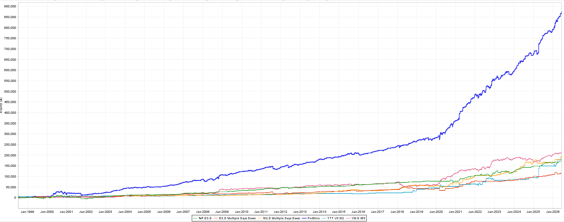
The blue line is the combined portfolio.
The individual strategies are shown underneath.
The portfolio equity approaches $870,000, while no individual model comes close to producing that result alone.
More importantly, the combined line is more consistent because it is not dependent on one definition of dip buying.
This is the power of systematic portfolio construction.
You do not need every strategy to trade a completely different asset class.
You need robust edges that do not all win and lose at the same time.
The Real Takeaway
The original Multiple Days Down model was published in 2009.
More than half of the performance shown here occurred after the rules were publicly available.
The results remained strong across two major index futures:
ES
75.24% winning trades
2.60 profit factor
$115,037.50 total profit
NQ
75.00% winning trades
3.33 profit factor
$198,150 total profit
Combined portfolio
75.13% winning trades
3.00 profit factor
$313,187.50 total profit
16.14 Return/DD
0.25 weekly correlation
But the bigger lesson is not the individual strategy.
It is what happens when we combine multiple robust return streams.
Our advantage as systematic traders is not finding one perfect model.
It is building a portfolio where different edges contribute at different times.
That is why I prefer increasing exposure through more markets and more strategies instead of simply pushing one model to its maximum position size.
One strategy can stop working.
One market can change.
One edge can stagnate.
A portfolio gives us more than one way to win.